Novidades do produto

Tudo o que mudou na Vibez, à medida que é lançado.

Feed RSS

September 2026

See how many people viewed an event

Event cards on vibez.io, on the Wall and in Spotlight, now show how many people have viewed the event — the same count the event page itself shows. It is there for the person deciding whether to tap, as a read on what is drawing a crowd, so it sits on the card as information rather than as a footnote.

Explore events

Vibez Pro in Hebrew

The whole dashboard is now in Hebrew: every screen, every menu, every status word, laid out right to left, with dates, times and numbers written the Hebrew way. The language is decided on the server, so a Hebrew page never flashes English first. The Help Center switches with you.

Hebrew renders in Heebo, the typeface paired with Jost in the Vibez design, instead of whatever your device fell back to. English stays exactly as it was.

Each team role sees only its own tools

Teammates with a limited role saw more than they should: a gate manager or a cashier could open Home and the Guest list, an ambassador manager could see order counts outside their scope. Fixed. Home, the Guest list, the Orders tab and the pending badge on Attendees now follow the role's permissions, so the person you invited to run the door sees the door.

Guide: invite your team

The affiliate app, relaunched

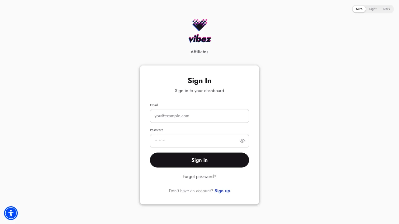
affiliate.vibez.io is on the new Vibez design: dark and light themes that follow your device, and type on one scale. The words changed too — your own page is your Profile, the brands you promote are listed under Promoting, and the app says affiliate throughout.

Event cards link straight to the event and state the commission plainly. Forgot password works end to end at last: a link by email, a page to set the new one, and you land in the app signed in. Every password field has a show/hide toggle, and typing the bare address now opens the login page instead of nothing.

The affiliate app login page on the new Vibez design
Open the affiliate app

Preview any event before it's public

Preview is in the event's top bar for every event. If buyers can already see the event it opens the public page; if not, it opens a preview only you can see, so you can check the description, the tickets and the flyer before you publish. On a phone, Help, Preview and Share fold into one menu so the event name keeps its room.

Same release: phone fields start with the country code of wherever you are, and automatic approvals follow the event type — the membership toggle on every event, order auto-approval on private events only.

Guide: share your event

Wristbands on the member profile

A member's profile now has a Wristbands section. The membership balance leads; under it, each connected tag with whether it is paid and a Disconnect button that asks before it acts. With nothing connected, the section says so instead of disappearing.

Why: at the bar the question is always "whose band is this and what is on it". That is now one profile, not a search across two lists.

Refunds: a 95% preset, and every ticket picked for you

Open Refund on an approved order and the sheet arrives ready: every refundable ticket selected, the amount set to 95%. Tap 100% for a full refund, or Custom to type an amount. Rows lead with the ticket holder's name and show the real ticket number, so a partial refund on a group order is unambiguous.

The presets now compute from the right base on an order that was already partly refunded. Order details also show the promo that was used, by its name rather than its code.

Guide: issue a refund

Attendee rows lead with the person

Ticket rows in Attendees now start with the holder: avatar with their community status, name, age and gender, the group chip beside the name, and the product on the second line. On desktop the table reads Holder, Ticket, Total, Status, Number, Promo. A ticket nobody has claimed says Unassigned with "bought by" underneath, and a person without a name shows their phone number instead of "Unknown".

Approve buttons on Home now say what they will do — "Approve 14 orders" — and the confirmation repeats it. One Cancel above the order's tabs replaces the per-ticket cancels, and the search field no longer loses focus while results load.

Order emails now carry the event's details

The order confirmation and the approval email now end with the event itself: Event · When · Where · Project · Contact organizer, in a block under your order. The button to your tickets stays at the top, your order details under it, then everything you need to actually show up — the address and the organizer's contact included.

Before this, the email named the event once in a table row and left you to look up the rest.

August 2026

Home shows events waiting for review

A new event sits in Pending while Vibez reviews it. Those events, and events you have not published yet, now appear on Home in their own band instead of in no list at all — the one gap that made a new organizer think their event had vanished.

Two related fixes in the same release: the share sheet warns you when a link will not work yet because the event is unpublished, and the daily snapshot on an event shows that day's page views, so you can tie a spike to the post that caused it.

Guide: why your event says Pending

Help for organizers, open to everyone

vibez.io/help is the organizer Help Center: more than fifty articles in English and Hebrew across eleven topics — getting started, events, tickets and discounts, memberships, ambassadors, access and wristbands, bars and cashless, payments and payouts, Vibez Capital, analytics, account and team.

It is the same library that lives inside your dashboard, published where a search engine, a new teammate or an organizer still deciding can read it without logging in. Each article is a short how-to: where the control is, what it does, what to check when it does not behave the way you expected.

Search sits at the top of the page, every article ends with the ones related to it, and Help now has its own entry in the organizer navigation.

Open the Help Center

Launch

Vibez Pro is live

Your new dashboard is at pro.vibez.io. Same events, same members, same money — rebuilt from the phone up, because the phone is where you actually run an event from: at the door, behind the bar, in the taxi on the way there.

This is the biggest change to Vibez since the platform launched, and it is not a re-skin. Every screen was redrawn around one question: what do you need to do right now?

What is in it on day one

  • Home is a to-do list, not a wall of numbers. Orders and members waiting on you sit at the top with the people behind the count; your events follow, sorted by what state they are in.
  • Attendees replaces Sales: Orders led by the buyer, Tickets led by the product, and a Guest list for comps. Every order carries its full story — who approved it, which scanner scanned which ticket, every refund and who issued it.
  • Members has a card you can act on wherever a person appears: change their status or their groups from an order, a ticket or the list.
  • Products and Codes with clear statuses — On sale, Paused, Removed — and a custom message buyers see on a paused ticket.
  • Announcements, Stats with income, demographics and a live view of the door, and Settings for details, payees, channels and your team — with roles down to a gate manager who sees only the door.
  • The Help Center and Vee are built in. Ask a question in your own words and get the answer, with the article it came from.

Nothing to migrate. No new login, nothing to install, no data to move. The classic dashboard stays open, and a switch in your account menu moves you between the two; both read the same data, so you can run one event in Pro and go back the same afternoon. New organizers sign up straight into Pro.

Open Vibez Pro

New feature

Comp tickets, with a guest list

Every event has people who should not pay: the artists, the crew, the photographer, the partner who sent forty people last time, your friends. Until now, comping them on Vibez meant a fake 100% discount code or a ticket held aside and handled by hand at the door — and neither showed up in your numbers as what it was.

Now there is a Guest list, under Attendees, next to Orders and Tickets.

How it works. Tap Add guest. Start typing a name or a phone number — if they are already a member, pick them; if not, keep typing and they are added as a new guest. Choose which tickets and how many. One tap, and the guest has a personal link to their tickets.

What the guest gets. A link that opens their tickets directly — no signup, no account, no verification code. Send it over WhatsApp or text from the share sheet that opens right after you add them; every row keeps a share icon for later. At the door they are scanned like anyone else.

What it does to your numbers. Comps come out of the same stock as sales, so a sold-out ticket cannot be comped and you can never oversell a room by being generous. Each guest is a regular order that happens to be free: marked as a comp, with who created it, and counted like any other order. Bar top-ups are the one thing that cannot be comped.

Managing the list. Search on top, tap a guest to open their order, remove a guest to take the tickets back — their link stops working the moment you do. You need a role that can manage orders to see the list.
Guide: comp tickets with the guest list

Home tells you what needs a decision

Home in Vibez Pro is not a dashboard. It opens on what needs you: orders waiting for approval and members waiting to be let in, each with the people behind the number and an approve button that says how many it will approve. Swipe a row to approve or decline, with an undo if you slip.

Under that, your events as they stand right now — live, on sale, ended — with the numbers that matter for each state, and then the activity feed. When there is nothing to decide, Home says so and gets out of the way.

Why: on a busy week the old dashboard made you hunt for the queue. Now the queue is the page.

Orders and Tickets, with the whole story of each

Sales became Attendees. Orders lists every purchase, led by the buyer; Tickets lists every ticket, led by the product, so the two never look alike at a glance. A pending order reads as New. Approve, hold or decline inline, with undo.

Open an order for its tickets, its buyer, its details, and an activity timeline that reads like sentences: who approved it and when, which ticket was scanned by which scanner at what time, a ticket reassigned from whom to whom, every refund and dispute with the person who did it. Refund the whole order or part of it from the same drawer. Dispute appears only on approved, card-paid orders, and a disputed order no longer looks like a declined one.

Open a ticket for the holder's card, the QR and the scan record.

Guide: approve or decline orders

Every Vibez email, redesigned

The emails Vibez sends were rebuilt on the new design: order received, order approved, order declined, refund issued, the sign-up and password emails, and the team invites organizers send. One layout, one clear button, the same look as the rest of Vibez.

They come from the same sender at the same moments as before, so nothing changes in your inbox except how it reads. Two long-standing faults went with the redesign: the organizer sign-up and password emails had greeted everyone with "Hi, " and no name for years, and the event-approved email had a button that led nowhere.

A promo code shows you the price before you pay

Apply a promo code on an event page and the ticket cards change on the spot: the discounted price next to the regular one, and a banner at the top naming the code and what you are saving. Change or remove the code from that banner. The cart carries the discounted price through to payment, so the number at checkout is the number you saw.

Before this, a code only showed its effect at the last step.

Guide: use a promo code

Brand assets, in one place

vibez.io/organizers/assets has everything you need to put Vibez on your own material: the logo in every official variation, a print-ready A4 tickets poster for the door, and a QR code that sends people straight to their own tickets rather than to an event page.

The poster goes at the entrance, the QR on a flyer or a story, the logos wherever you say "tickets on Vibez".

Get the assets

July 2026

vibez.io opens on what's on

The home page of vibez.io now leads with live events instead of a pitch. Three things on one page.

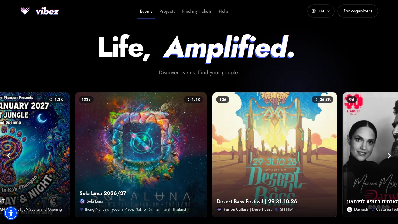
The Wall is what is coming up in your country, soonest first, as flyers at their natural size — keep scrolling and it keeps loading. Spotlight is a row of events we pick ourselves, across countries. Find your people lists the projects behind the events, searchable, with a verified badge on the ones we have checked.

Open any event and you are on its ticket page. Search covers every event on Vibez, not only the ones loaded on screen. Organizers have their own front door at vibez.io/organizers, one click away.

The vibez.io home page: the Spotlight row of event flyers under the Life, Amplified headline
Explore events

Attendee help, and Vee to answer it

vibez.io/attendees/help is written for people going to events: buying tickets, where your tickets are and what is on them, sending a ticket to a friend, getting in at the door, your wristband and its balance, memberships, your account. Thirty-odd articles, in English and Hebrew.

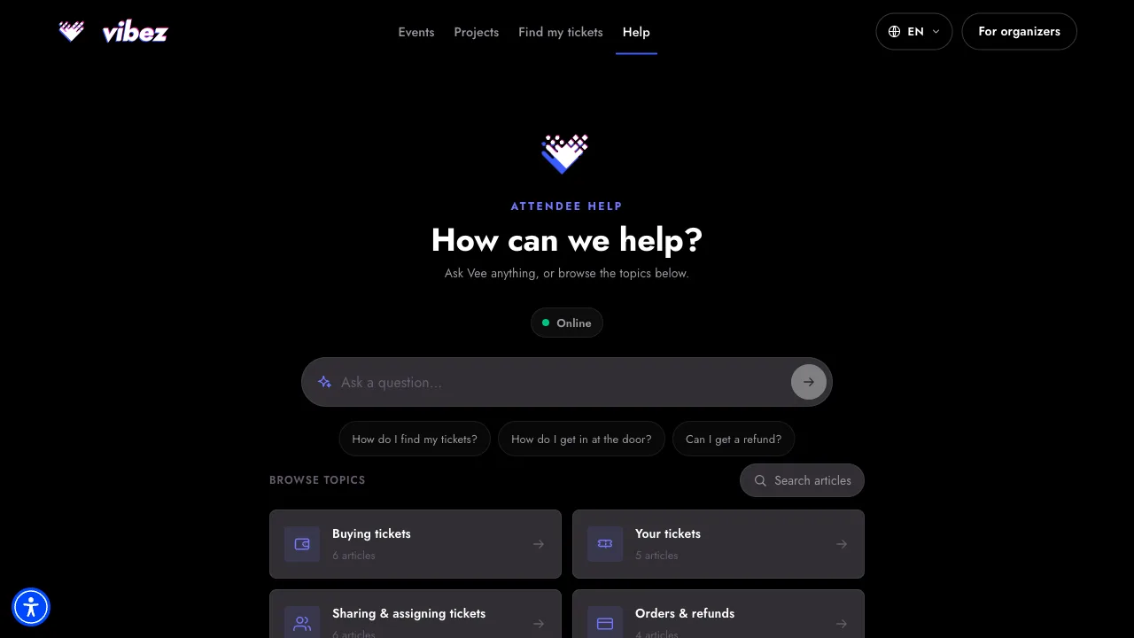
Vee sits at the top. Ask in plain words — "my friend paid, where is my ticket?" — and Vee answers from the articles, then links the one it used so you can check it. A small pill next to Vee says whether it is online right now. If you would rather browse, the topics are right underneath.

The attendee Help Center: Vee's question box with an Online pill, suggested questions, and the topic grid
Ask Vee